Date: 31 March 2017
When renovating a historic space for a new use, one large challenge for architects, developers, and owners alike is to be mindful of the architectural significance of maintaining certain character and details.
It can be very challenging to strike a balance between old and new. A recent example of this artful dance is the lobby renovation at 195 Broadway, a location many New Yorkers know as the 100-year old AT&T Building.
Designed in the vein of Greek and Egyptian temples the building’s first-floor interior was intended to signify “quality, durability, and permanence,” reflecting the phone company’s “commitment to public service,” according to documents prepared for the New York City Landmarks Preservation Commission.
The building, constructed between 1912 and 1922, served as AT&T Inc.’s Headquarters until 1983, according to city documents.
Sold to investors just four years ago, the buyers acquired the majority interest in the 29-story “wedding cake” office tower and say its value is immeasurable due to the proximity to the World Trade Center. It is 100% leased to office tenants including Omnicom, HarperCollins Publishing, and Thomson Reuters Markets.
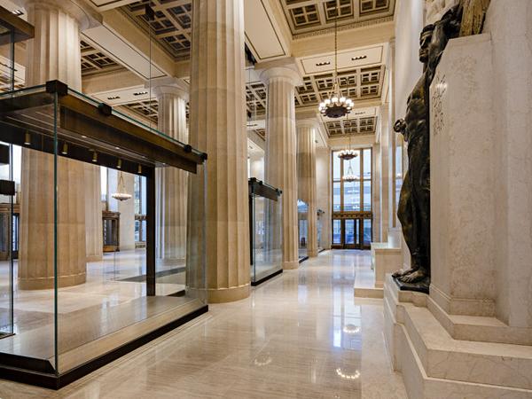
The remarkably beautiful structure has polished stone walls and floors and 4-foot diameter fluted columns 17-foot on center. The coffered ceiling towers 30 feet above with intricately decorated, inset painted plaster panels.
After five years in the planning, L&L Holding Company wanted to make a grand statement for its tenants and their clients upon entering the building. Their aim was to modernize it for multipurpose use without losing the heritage. The plan was to call for a complete renovation of the lobby and concourse-level installation of 35,000 square feet of new retail space.

They wanted a tried and true design using stone, steel, and glass. The nationally-acclaimed experts at W&W Glass partnered with McLaren Engineering to manage the project.
TriPyramid Structures, Inc. was commissioned by W&W to design, engineer, and fabricate each of the custom bronze patch fittings, keeping them as minimal as possible yet able to sustain all the heavy loads jumbo size glass panels would impose.
Due to the landmark requirements, the walls, floors, and ceiling needed to have minimal disturbance or modification.
Originally, the building was built in two phases – the southern half was mostly built in terracotta for both the wall and arches for the floor slabs and the northern half had steel structure.
Anchorage for the new walls needed to accommodate both scenarios. In short, this would take not only take a very well planned design but also careful logistics.
Since this magnificent lobby was mostly unused space, due to the strict security requirements now as required in the NYC buildings, the plan was to separate it into a leasable retail and restaurant space separate from the main lobby entrance.
They partitions would utilize floor-to-ceiling, ultra-clear structural glass walls to be as unobtrusive and transparent as possible.
The architect’s original intent was to have large, single-span vertical glass lites with only three lites across at each bay (bays varied from 17′-0″ to 17-8″ wide) directly behind the columns creating a “Galleria” from the North to the South end to divide the building. In the center of each bay would be a 9-foot wide by 10-foot tall vitrine to act as display windows with some as entrances to the spaces.
These vitrines also included a glass roof. The 10-foot tall side walls of these vitrines act as fins that support the lateral load for the whole 30-foot tall glass wall.

After concluding that it would be impossible to maneuver a single piece of glass, almost 30-feet tall in this space, the plan changed to use 10-foot tall bottom lites as the vitrines and fins with a large upper lite as tall as 19-feet in some instances.
W&W’s project manager Maria Colucci-Hudgins explained that since this space was leased to be a restaurant, the entrance not only needed to be an egress door but also ADA compliant. On the other hand, the second wall was to include two glass elevator enclosures within the wall.
One was very close to the main Galleria wall, which created a severe logistical consideration due to lack of space for the installation.
These changes not only challenged the design and engineering of the glass for the wall, but also the custom hardware patches to support the glass. There were 23 custom patches developed by TriPyramid using aluminum, stainless steel, and bronze.
As the renovation continued, the architect, engineers, and installation crews had to be in constant contact to figure out solutions as a myriad of issues came up.
For instance, the installation required a machine installation with a specialized glass lifting device called a Jekko to lift glass lites weighing 1900 pounds.
That meant the installers needed to add two layers of plywood to the existing layer of protection so as to distribute weight of machine when moving around in building to not damage the stone flooring.
After the machine was set up to lift glass, workers added beams under each leg to make sure each of the four legs were spanned across floor beams to ensure there were no points loads on specific area of the floor.
Moving the machine and setting it up was very labor intensive as the men carefully transported the plywood from the back of the machine forward as it progressed.
The tight space between the columns and the weight of the glass required the machine to be upright and centered on the location of the glass. This was extremely time consuming since the machine had to be relocated for practically for every lift.

There was a code requirement that the walls that divided different tenant spaces would need to be fire-rated. The designers didn’t want to sacrifice transparency, so to be in compliance they eliminated using silicone in the joints.
This required the joints to be as minimal as possible between glass and perimeter metal. This resulted in a very tight tolerance availability for manufacturing and installation for these massive glass panels.
W&W Glass craftsmen were able to maintain a 3/8-inch joint between all glass panels. To complicate logistics even further, there was also a requirement to make sure there wasn’t any live load deflection of the floor above of 7/8 inches.
To accommodate this, a bronze continuous closure at the sill was introduced to be as minimal as possible.
No detail was left uncared for in trying to make the renovation as seamless as possible to preserve the history of the existing structure, which is why antique bronze finished fittings were used to match the existing building finishes.
During installation, glass had to be spread out all over building because of distribution of weight onto floor areas and beams below.
Each structural column could only hold a maximum of 3 crates that were extremely long and deep. 94 crates holding 178 lites had to be staged very carefully for installation because of the size and weight of the glass.
A significant amount of time was dedicated to logistics and coordination of many different specialist trades and other crew.
Transportation of massive amounts of steel and glass took intricate scheduling and expertise. All this work had to be done in this very tight space with minimal disturbance to the decorative plaster ceiling.
If you asked anyone on the design, manufacturing or installation team, all the hours, weeks, and months were worth honoring the history of the building and the future that lies ahead.
 600450




Add new comment