
Date: 28 July 2016
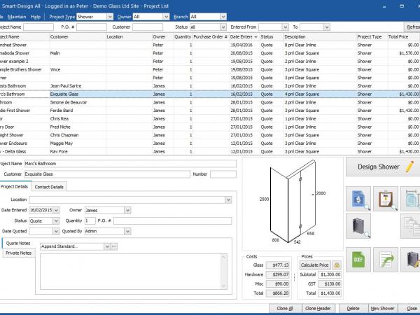
While always at the cutting edge of visual glass design with diagrams, interactive drawings and colour 3D views of structures, Smart-Builder applications have traditionally followed the standard Windows look and feel.
From Smart-Builder's next release the default appearance is Smart-White: a clean white background, blue windows surrounds and blue highlighting.
The effect is similar to the appearance of Microsoft Office 2016. For those not ready to say goodbye to grey there is also a Smart-Grey skin which keeps the blue highlights but with a grey background. Of course, customers can also revert to the default Windows look and feel if they wish.
 600450










Add new comment