
Date: 14 August 2017
The Block and Viridian, through its new ultra-clear glazing LightBridge™, have partnered in a high profile usage of this innovative product.
High daylight transmission and solar control properties create new opportunities for architects and product specifiers to achieve high levels of natural illumination and comfort.
The Block’s Octagon project is the first public outing for a product designed to assist high levels of amenity of economic function.
Project: The Block 2015 – The Octagon South Yarra, Melbourne VIC
Architect: Julian Brenchley
Principal Glazing resource: Viridian LightBridge™ IGUs
Window frame supplier & installer: Viridian
Viridian technical support: Home Comfort
Principal glazing: Viridian LightBridge™ IGUs, Argon-filled, Clear
Text, images & Film: Peter & Jenny Hyatt
Identifying opportunity when others pass blithely by was the first achievement. Since then, there has been no holding back those behind one of Australian television’s great success stories.
The Block architect, Julian Brenchley of Sydney, speaks of his immediate intrigue and seduction by the quirky former motel on Melbourne’s Commercial Road in fashionable South Yarra. “I was fascinated,” recalls Brenchley, who has been a stalwart and driver of project selection since the program’s start in 2002.
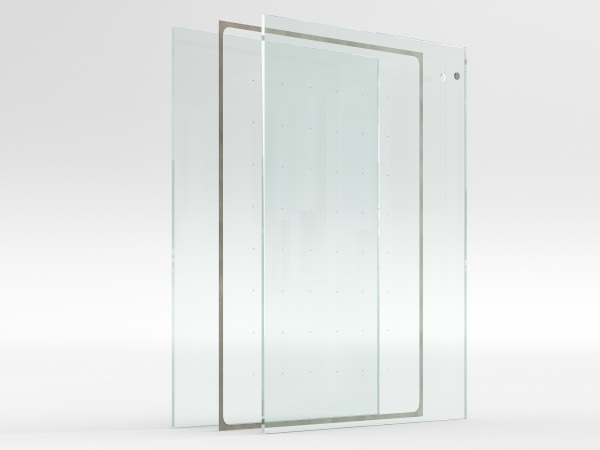
The Octagon is also one of the first public applications of Viridian’s LightBridge™ glazing. Ultra-clear yet with a high UV defence, this unassuming glazing system promises to deliver diva-like results. Its clarity and stellar environmental performance contribute hugely to the Octagon’s new relevance.
Julian Brenchley spoke with Peter Hyatt about recycling a building of dubious design merit and turning it into a show-stopper. With double the usual number of facades—8 instead of 4—we could be forgiven for wondering if the Octagon represented double-trouble rather than sweet opportunity:
Vision: The Block conjures thoughts of a rectangular or square building and yet here we are in an octagonal building. It’s utterly different from anything else The Block has tackled.
JB: It is. The Block is by definition a ‘block’ isn’t it, yet The Block is really an evolving entity. The various buildings we locate inform the show, because we’re so strongly focused on adaptive re-use. An octagonal building
presents its own opportunities and some very, very complex challenges. This one’s been an interesting journey. I hate the word ‘journey’, but that’s how it feels to take something of its time and bring it alive again.
This building is a mini-landmark in many ways, loathed and loved.
It’s a bastard of the ‘60s and ‘70s and a brutal architectural style. It was purpose-built as a hotel, so really the most efficient way to reduce corridor length in a hotel is to build it around a core. There were no long corridors in this hotel, just a fan of rooms around the central core.
Its eight-sided form was an unusual approach even for its time.
Yes, there are very few of the octagonal variety. Several circular buildings; there’s some notable ones in Sydney and they create their own challenges.
When you first sighted this building did you ask yourself, “What have we got here?” or “Is this the real deal?”
I nearly jumped out of my skin when the program’s executive producers Julian Cress and David Barbour gave us the opportunity to use this building. I was very, very keen to see the floor plan for a start and what opportunities existed. I’m lucky enough to consider many buildings way in advance of the show…
We get the fun part, to see if it can actually work and what are the problems? Do we turn this into whole floor plates, or do as staggered, split-level apartments? Really what we do is consider it as a cube made of Tetris elements over several floors, as a whole floor-plate.
You remain faithful to the original plan.
That’s partly out of the practical aspect of getting this job done in the short time frame we have, although we’ve gone from seven hotel rooms per floor to whole, single-floor apartments. There’s a distinct lack of amenity in the old-style hotel room, compared to a luxury apartment we’ve created.
For instance, there are no wrap around balconies. There are no covered outdoor spaces. There’s none of these things you might expect to find. It’s very similar to the Shazam app on your phone. When you play Shazam the circle moves in and out as it’s playing the peaks and troughs of the song. If you imagine this
building as an octagon, it’s moving to suit the building function. We force the building out to the north to capture light and create covered outdoor space. Where elbow-room is needed in a kitchen or a living room, the building stretches and expands there. We retain the octagonal form by creating ‘wings’ or ‘quadrants’ of an octagon.
The octagon form highlights the interiors and remains true to the plan. It is difficult dealing with a building in the round, trying to translate that to an elevation. Architectural features on the outside to a large extent dictate what’s going on inside, but overlay that with an octagon and you’ve got all sorts of complexities.
How do you go with each season of The Block with such an ascending spiral of expectation?
I think that’s part of human nature in a way, to build on your past successes. We set out to find something bigger and better. We’ve been lucky enough to find the raw buildings pretty much in line with this sort of ascension of scale. It all began way back when the brief was to find a building that could be adapted to make it aspirational.
We’ve gone from bigger and better and it’s partly to do with the success of the show. From a building perspective I’ve been lucky enough to help create these great spaces in bigger and better raw shells along the way.
In many ways it’s a program about interior design, but it’s also a program about the potential of architecture to be re-born.
That structural, bigger eye and hand is definitely involved, even though some people might consider The Block merely superficial and all about wallpapers, furnishings, finishes and drapes.
Of course the show is about the contestants and sponsors and all of the machinations of chucking people into the frying pan. I’ve always had an agenda to reveal to the greater public what is achievable in an architectural sense.
While my brief is to definitely make the building look good, because it has to sell, I take that brief very seriously. I also add to that brief in my own mind and the way I approach it is meant to be readily accessible by viewers.
The architecture and interior design aren’t disconnected. One needs to belong to the other in the way steel beams intersect, glazing is used and the lamp sits in the context of the room.
As each Block project unfolds we gradually see those relationships. It’s definitely a case of the knee-bone’s connected to the thighbone. It’s all part of the single whole.
Again, that’s part of the beauty of finishing these things and the great reveal. It goes a bit further with the idea of architecture that carries through this environmental and sustainable brief.
Which is really such a big and important part of The Block, isn’t it?
It’s the big story of The Block on a number of levels and the most basic one is that we’re constantly doing adaptive reuse of existing buildings. There’s some really good stories too with environmental and sustainable design, whether that’s adaptive reuse or products introduced on this show.
We’re achieving terrific energy ratings too—through the roof. It’s a big part of an unsung story. Four series of The Block ago we had one of Melbourne’s first 8-Star buildings. That was a bit of a coup for us, and at the time Matthew Guy the then Planning Minister launched the Open for Inspections.
We’re still achieving those kind of ratings and it’s become a standard for us and we’re lucky enough to continue that. We mightn’t always hit it, but we’re getting way above what’s needed. Once you’re beyond 8-stars and heading towards 10…!
Adaptive reuse gives you a huge advantage over building from scratch.
Adaptive reuse is a massive component of the star-rating system. We have to try and hit the performance criteria hard with insulation, low VOC carpets and you name it, paints, light fittings, water usage, water recycling, water harvesting, anything to do with the air conditioning. We really follow through quite aggressively.
And yet you ensure designs that appear sharp rather than dowdy Green.
I liken it to the cool guy walking down the street with the flares and the retro parka, a crazy beanie and out-there sunglasses. You think: “I want that look. That perks my interest”. That’s the opportunity presented with this building. We’ve really been able to have fun with this.
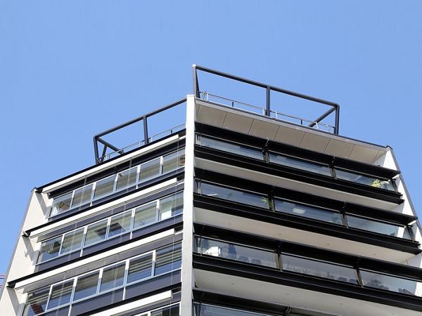
The outside of the building is a testament to that, because each segment of the octagon appears like a fresh new building. That results from this stretching of the building without losing the building form. Each component has a different appearance that corresponds to its orientation and use.
It stands out from so many modern apartments that all have this resemblance as if they’re from the same hand.
You can almost imagine James Bond’s Aston pulling up outside and him sitting on the balcony, surveying the skyline with a martini in hand.
I hope so.
Do you continue learning from each Block challenge? Or is it now more of a carousel of recurring problems?
Well there definitely is that carousel of recurring problems. That’s part of life. I’m a great advocate of the saying that you really never know everything. Every project in architecture presents its unique problems.
Then again I’m also a great advocate of the idea that there are no problems, only opportunities that haven’t been realized, or solved.
Really at the end of the day we do produce some good stuff. These answers are founded in real-life, often complex issues. They don’t ever disappear, so we just really have to stump up and learn from the past and apply that again and again with a new flavour, a new look.
Where do you see The Block heading?
We’ve always said that the sky’s the limit. We really don’t know where it’s going next. The formula’s very popular but there are greater minds than mine that decide on where to take the show. I’m yet to be instructed.
As has been the case and I think it will continue to be the case, The Block evolves with the stock and opportunities presented and the imagination of the executive producers at Channel 9.
It’s interesting that many of the qualities of your work with sustainability operate in a very unobtrusive way. It’s not shouting “Look how green I am”. It seems to go about it quietly.
That’s very important to my architecture. Whatever these achievements are they’re to stand the test of time so whether they’re trendy or not, that’s a matter of opinion. From my point of view these are meant to be understated and softly spoken rather than flashing ‘Green’ in neon lights.
Which a lot of Green buildings do. Quite a few win awards.
They win awards which is admirable, but from my point of view just because a project has, say, recycled cladding and screams environmentally friendly, in five years time when that cladding has to be replaced because it’s rotten, that’s not Green, or environmentally friendly.
LightBridge™ is an exciting new Viridian product. What’s your view and understanding of it?
I view any of its products—and there are some amazing ones—as a constant evolution of glass technology. First came float glass and then we became excited about laminated safety and toughened glass. New glass firing techniques see various ceramics or carbons added to create glass that can do things we didn’t believe possible.
The benefits of heat retention and low solar gain glass are very obvious. LightBridge™ has thermal properties over and above what you’d expect. In my view it’s as good in a thermal performance sense as most walls.
It’s quite astounding if we dip into the double glazed scenario of LightBridge™. It’s well beyond compliance of U-values and the shading coefficient of the building code of Australia and Section J.
So new frontiers are now possible for glass?
It’s definitely opening up opportunities. Glass products such as LightBridge™ are creating those openings for designers. That’s a real bonus.
The big point about all of that is architecture in a built environment is very conservative and traditional. It’s very exciting to be able to explore new products directly from the source. That’s a great opportunity for me.
One of the very appealing features of LightBridge™ for this project is the use of a clear glass that is a return in appearance to the ‘60s and ‘70s.
The ‘80s and ‘90s were very much about tinted glass. The clarity of LightBridge™ has an authenticity with that era, but offers remarkable performance characteristics by comparison with glazing of that era.
When people referred to high performance, environmentally rated, or sustainable glass, you’d think SuperGreen™, or one of those shades. You walk into buildings that now have SuperGreen™ and they’re performance glass, I understand that.
I find the green, blue and grey tougher to realize. Now we have the opportunity to use clear that offers exceptional, environmental performance. And we’re not changing the building color.
On the north side of this building—the punishing heat load facade in summer—you retain very deep, generous balconies to complement the strategy to help the bands of glazing deal with direct solar pressure.
Those definitely help, especially where the balcony doors open to create very lovely, liveable areas. I’ve said before that I pretty well detest balconies when they’re used as the primary open space because really there’s zero privacy. Balconies are a real conundrum for architects.
What kind of amenity are you offering—if there is no way for occupants to use and enjoy this space without privacy. At some point there’s a trade off between the concept of view, outlook from inside as well as being able to enjoy the space. ‘Private enjoyment’ I think is the right term and it’s how to find that right balance.
Have you found any answers or strategies to solve the problem?
We’ve been involved with several buildings with solid balustrades on lower levels. The higher up the building, as privacy becomes less of a concern, because of distance, you introduce glass balustrades.
On the lower levels we offset the solid balustrades with deeper balconies, so that the amenity is not reduced. It simply changes by virtue of where the balcony is located on the building. Internal courtyards have been a bit of a divider, but I believe it’s a really worthwhile building typology.
Not only for light, but ventilation?
Especially ventilation. Courtyards drag in a lot of light and internal courtyards create an opportunity for doughnut style planning opportunities, where you can have natural ventilation from a number of sources rather than just one. And it can be quieter with those internal doors open rather than onto the street.
The single floor-plate apartments also breathe better than the more common, partitioned variety.
Here we can slide doors open to the north and open a window on the south side which immediately generates a beautiful cross breeze. With their deep balconies and clear glazing it’s a natural wonder, rather than over reliance on air-conditioning.
Do you have a project highlight?
What I’m most happy about is the apartments themselves. It’s amazing to see what these contestants do in the time. The integration of some of the sponsors material, CSR and Viridian for instance, make quite a unique palette of materials that has enabled us to come up with this composition.
The project highlight is that each segment of the octagon maintains its integrity yet has a different appearance. It’s almost like eight buildings, but works together as a form. We had to really search and do a lot of R&D and 3D modelling to see if we weren’t creating eight problems from eight opportunities.
 600450








Add new comment