Melbourne’s inner-city Prahran remains one of Australia’s residential hot-spots. Best known for its hipster shopping and cafes, the recycling of its heritage buildings is generating some of the more inventive solutions for higher urban density dwellings.
Project: The Station Hotel, Prahran, VIC
Architect: Interlandi Mantesso Architects
Interior Design: Interlandi Mantesso Architects
Builder: Figurehead Construction
Developer: Saade Group
***
Facade Engineer: Inhabit Group
Framing Fabricator: CWI
Principal Glazing: Contractor Viridian
Glazing Resource: Viridian (Iain Kennedy)
Principal Glazing: Viridian custom double-print Seraphic DesignTM, heat-strengthened feature pattern
.jpg)
.jpg)
In its previous life the Station Hotel in Prahran’s Greville Street was a favourite watering hole and stay-over for generations. Its recent revision by architects Interlandi Mantesso (IMA) sees 41 apartments rise discretely behind the classic Victorian pub facade and an uber-cool, bespoke, Viridian glass shell.
.jpg)
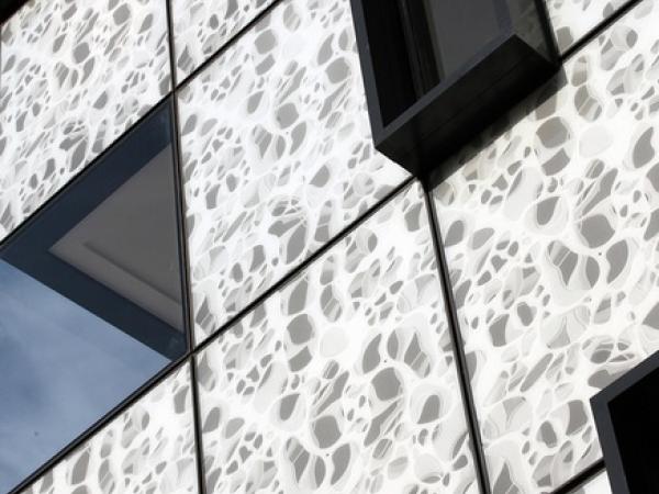
Rather than ubiquitous tilt-slab box, the development features Viridian’s seraphic glass – made graphic by a microscopic view of human bone – to help sell the story behind its human scale and aspirations. New pavement level retail and super convenient location are among the selling points for this high visual impact project destined to become home to a booming Gen X and Y market.
Rather than the lifeless and applied, the seraphic glazing is instrumental in reinvigorating a once bustling pub as a residential haven.
.jpg)
Peter Hyatt spoke with project architect and director Robert Ficarra of IMA about the rise of an apartment complex with a bold difference:
How difficult is it to work with the fabric of such an old structure?
Whenever a project involves a heritage building one of our design struggles is to try and achieve a balance between “respectful fabric” of the old building and introduction of the new.
What about the cost of tip-toeing around old bones rather than working with a clean slate?
There’s that economic balance to maintain and preserve old structures when building adjacent to, or building into them. And to deal with heritage controls where any proposed building is considered to enable the existing building to stand-alone and remain legible.
.jpg)
Any other constraints?
It is in quite close proximity to the Prahran Town Hall and the old clock-tower. These elements really influenced the need to respect sightline vistas and the heritage fabric.
How quickly did the solution of the patterned glass facade occur?
Once those design constraints came into play, the building envelope evolved quite quickly. The design has two flanking components of similar height and scale as the hotel to the streetscapes. Beyond and behind that, is the large glazed facade of the “new” that would contrast and compliment the masonry fabric of the hotel, a program that really delivers a contemporary presence.
.jpg)
A challenge for all developers is the volume of apartments flooding the market. How do you give your project the genuine signature, rather than applied logo? Is this a major consideration?
It’s uppermost in our minds. Any development we work on demands a design with a distinctive difference to help with the marketing. We don’t rely purely on the external aesthetic so much as a combination of an exterior appeal fully supported by its quality interior fitout and internal ambience.
Is this design more the introvert, or extrovert?
A combination of both! The whole package is alive during daylight hours with that glass facade responding to the changing light and taking on a whole new appearance of an evening. The contemporary interiors are befitting of the area.
.jpg)
What was behind your decision to provide this specific glass identity of patterned seraphic?
The glass facade against a traditional fit, provides a very modern architectural aesthetic. It gives the distinctive contrast that respects the heritage building. The two read quite independently of each other, yet are not competing. In glass, there is the reflective element, but in this particular case, what we have chosen is to use glass as a cladding system, because the seraphic glass in this facade is not transparent.
It’s essentially curtain wall?
Yes it is. All the apartments have windows that are easy to access for light and ventilation and comprise a Viridian clear glass. That remains a constant throughout the building, yet the skin is very much a cutting edge system, derived from a commercial curtain wall application.
.jpg)
Does the glass screen compromise outlook?
No, because the vital layout of the apartment unfolded in a way where the view is required, the window systems are traditionally positioned for outlook within the facade fabric.
How did your experience with glass prepare you for this specific response?
What has transpired in glass technology over the past few decades has resulted in an ever growing presence in multi-residential developments – and not just applied traditionally for access to light and ventilation. The application of glass facades that were once typified for commercial buildings is transferring.
Modern Melbourne apartment buildings, predominantly the taller city buildings are utilizing glass as the facade – being applied creatively and producing a very sleek result. As buildings soar higher, the way we once opened doors and windows to the outside world is no longer permissible and simply doesn’t work.
Applying that technology and principles to smaller structures can incur a big penalty because it is such a small component of the building element, but aesthetically it offers a much more pleasing response. The shorter answer is that we are definitely looking at transferring glass treatments from commercial applications to many of our residential projects.
.jpg)
Was there a design light bulb moment, or did the answer occur slowly, organically?
It occurred quite instinctively. We wanted a strong counterpoint to complement the old, heritage building. Glass immediately came to mind. The choice of the graphic was an evolution of ideas, evolved by our design team and it’s a strong monochromatic feel for the facade. Because the facade is reflective and translucent, it is particularly interesting from dusk through to dawn with this subtle glow.
If daylight is one of the great pleasures here, it also has the potential to create the challenge of heat transmission. How does your design respond to that?
The glass facade is actually a wall treatment applied to the inside face. Obviously any opening that relies on providing light and ventilation has to be treated in a manner appropriate for energy efficient design. Today that involves the appropriate thickness and type of performance glass, and double-glazing if necessary. The balconies along the north and east facing elevations are recessed balconies to maintain outlook yet restrict direct summer sun.
.jpg)
Did your client have any apprehension about your initial renders and sketches?
They didn’t waiver at all about such an expression. They were very encouraging and supportive and were really proud of the result. The response and the feedback from the community has been very positive.
Any acoustic issues given the proximity of the train line? One of the more typical responses is to design with very small window openings to manage noise.
We have this beautiful position with a northwest orientation and wonderful outlook to the city. More than 50 percent of the apartments have a city view which is sensational. At the same time there is a train station at our doorstep. The noise of the trains can be heard, but it is never uncomfortable.
.jpg)
Did Viridian assist with the process of glass selection?
They provided plenty of samples. They were fantastic, make no mistake. We reviewed the range of colors and seraphic pattern options. That process of approving graphics, scale and color was quite a lengthy process but Viridian was always forthcoming and always very helpful.
How did you arrive at such an individual design?
We decided upon a graphic that really required a lot of preparation. There is a distinctive relevance about why we chose that design for this building’s overall presence and fabric. We felt that facade would work successfully with the neutral aspect of glass as restricted to white, grey, white and black. That was a conscious decision, to keep the colors to two tones only, but the actual image itself, is actually a microscopic view of the human bone, the skeleton.
.jpg)
What have you learned from this project you will use in future?
I would definitely explore the potential for the graphic glass to be expressed internally – not remain as an external cladding alone. I would love to see some of the exterior repeated or transferred inside. That would be a big bonus.
To help blur those boundaries between outside and in?
It can be explored. I’ve learned on these projects from that missed opportunity to resolve the external expression with the interior experience.
.jpg)
And that value-adding is often in the details and parts of a project where someone has cared enough to achieve a much better than average result?
The whole project should be read more than by a simple curb-side assessment. When you walk through the front door of the common area and each apartment, you will see the level of finesse we have tried to achieve.
.jpg)
Related Products
.jpg)

.jpg)


