First presented at GPD 2017
Abstract
Not since City Hall has a tall building truly addressed the issue of creating an iconic skyline for Los Angeles. The Wilshire Grand Tower is a building of our time; a contemporary contrast to a generation of flat top buildings composed of granite and inset windows. Fulfilling a design vision of glass in L.A.’s seismic Zone 4 environment will be examined in this manuscript.
Offering views never seen before in downtown Los Angeles, large format glass clads the tower to maximize visible light and openness. Factors that influenced the glass selection and stack joint design will be reviewed.
Reminiscent of Yosemite’s Half Dome, the 73-story tower rises above a solid podium base. Bridging between these forms is a lyrical double curved skylight that provides the enclosure for the central Atrium. The challenges and innovative solutions involved in achieving this parametric building feature will be explored.
Finally, the design of the iconic Crown will be investigated. The signature top rises 10-stories above the tower’s observation deck. Wrapped in glass, the Crown completes the architectural parti while responding to G4 forces.
Introduction
In the heart of downtown Los Angeles, at the site formerly occupied by the Stadler Hotel, rises the new tallest building west of the Mississippi, the Wilshire Grand Center. It was Korean Air’s vision to create a single, iconic tower – a symbol of the friendship between South Korea and the United States, an investment in Los Angeles – the city that hosts the second largest Korean population, next to Korea itself. The Wilshire Grand Center is comprised of a 900-room, four-star hotel that sits atop eighteen leasable office floors.
Its podium includes hotel convention spaces – ballrooms, meeting rooms, break-out areas, along with a health club, retail spaces and restaurants. Five underground parking levels are provided to meet local requirements and serve the guests and tenants of the Center.
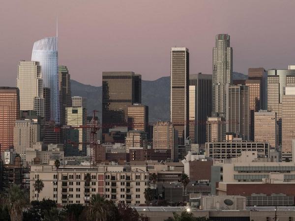
There were five big design ideas set forth by the architects and designers at AC Martin. The first big idea was to change the Skyline of downtown Los Angeles, as shown in Figure 1. Acknowledging that the Wilshire Grand Center would be the first significant tower to be built in Los Angeles in over twenty years, the AC Martin team sought to create a building of our time.

The downtown Los Angeles skyline is characterized by a generation of high-rise buildings with truncated flat tops, responding to the Los Angeles Fire Department’s 1974 Ordinance requiring helipads for high-rise buildings. Taking into consideration lessons learned in the past 20-25 years, coupled with advances in fire suppression systems and exiting strategies, negotiations were successful with the Fire Department and project team to gain relief from the 1974 Ordinance.
The second big design idea was to create an accessible Sky Lobby. By locating the hotel’s lobby at the top of the tower, all hotel guests would be treated to the never-seen-before views of downtown Los Angeles that could be experienced at the 70th floor. High speed, double-deck elevators transport guests at 1600 feet per minute from the ground floor to the 70th floor, facilitating high-volume vertical transportation.
Considering the fact that the project site is located in southern California, the next big idea was to take advantage of the temperate climate in Los Angeles. With average temperatures in the 70’s (Fahrenheit), the building was programmed to maximize the use of outdoor spaces. Ballrooms have operable walls that open onto covered outdoor spaces. The hotel’s porte cochere is a covered outdoor space that drives through the center of the site. A generous pool deck facilitates recreation and relaxation, while flanked by cabanas for more private gatherings.
Taking advantage of the Urban Context was the fourth big idea. The Wilshire Grand’s site is located at the confluence of two major axes in downtown. The Figueroa corridor runs in the north-south direction. With L.A. Live to the south, the Wilshire Grand Center becomes the northern anchor to the rise of major building developments along the corridor. In the east-west direction, 7th Street has experienced a renaissance of restaurant and retail developments that lands at the front door of the Wilshire Grand Center.
The fifth big idea was to optimize efficiencies wherever possible. From the design of the mechanical systems for the tower to the utilization of prefabricated restroom units throughout the hotel, the designers were challenged to be efficient while not sacrificing quality. The philosophy of efficient design is a backbone of Korean Air’s success for generations, and the design team was highly encouraged to employ these principals in the design of the Wilshire Grand Center.
The Main Text
The journey toward creating a towering icon involved poetry and practicality. The beauty of the form was derived from an array of architectural and artistic tools that spanned several generations. From the fluidity of water color paintings, to spastic collections of computer generated Rhino model forms, to 3-D printed models, to basic paper models, each tool contributed to the sculpting of the Wilshire Grand’s aqueous forms. Viewing the building from various vantage points, the shape of the tower is sometimes reminiscent of Half Dome in Yosemite, and sometimes it is reminiscent of an airplane wing, a literal metaphor to Korean Air’s aviation business.
![Figure 2 – The Wilshire Grand Tower under construction. [1]](/sites/default/files/inline-images/Fig2_51.jpg)
The tower is a glassy expression of our time with a high performance skin, a departure from the granite inset windows characteristic of most buildings in downtown Los Angeles, as shown in Figure 2. The curtain wall was designed to maximize views and ceiling heights for the office and hotel uses.
Employing large size glass panels, kiss mullions were provided to set a datum for finished ceilings. The composition of the tower’s form was rationalized into measurable geometries, facilitating the use of repeatable units for constructability and to meet the project’s cost parameters.
The rectangular, slender tower form challenged the structural engineers from Thornton Tomasetti and Brandow & Johnston to develop a structure that would not tip over, while responding to the inevitability of ground motion in a seismic zone four location, a seismic hot zone.
The structural design involved a 17.5 feet deep mat foundation with over 6.6 million pounds of densely woven rebar and 21,200 cubic yards of concrete to set the stage for breaking a Guiness World Record for the largest continuous concrete pour in the world on February 16, 2014.
Rising from the foundations is a concrete core with massive four feet thick walls, ascending and tapering to two feet thick walls at the top. At three strategic locations over the height of the tower, outriggers extend from the concrete core to capture the perimeter box columns.
The outriggers are composed of bucking restrained braces (BRB’s) that act as shock absorbers, resisting vertical and lateral forces. At the top and bottom outrigger locations, belt trusses of steel wide flange members encircle the floor plate to resist torsional movement.
The design of the curtain wall panels considered eight sources of structural movements [2]:
1 - Interstory drifts (lateral displacements) under lateral load conditions
2 - Vertical movements of horizontal framing members under live load
3 - Column shortening from construction load after panel installation
4 - Column shortening from imposed compatibility with concrete core creep and shrinkage
5 - Differential gravity and lateral movements at terminated columns near sloping columns
6 - Differential gravity movements at floor extensions at building ends
7 - Main tower column shortening and lengthening from lateral loads
8 - Thermal strains
Taking into account the largest of the anticipated movements, the stack joints of the unitized curtain wall system were designed for an open position of +7/8” and a closed position of -1 5/16”. The profile of the stack joints was designed with a gentle curve to create a shadow line for visual depth.
Nestled between the 73-story tower and the solid podium base is the river that runs through it, a lyrical doubly curved skylight, as seen in Figure 3. Providing a glass roof enclosure for the hotel’s central Atrium, the skylight stretches from one end of the property into the public plaza, as shown in Figure 4. It covers a volume that is 80 feet tall at its peak and 30 feet tall at its valley. Balconies from the hotel’s convention floors look onto the Atrium. The light-filled space is the heart of the property, the central nucleus of circulation and wayfinding.


The poetic idea was one thing. Making it real was another thing. The design development process involved tackling major challenges, including cost, constructability and seismic movement. It was clear from the onset that the project could not support the cost and schedule implications of curved glass. The skylight was perpetually on the development manager’s value engineering chopping block. If the skylight was to become a reality, it would take a great deal of persistence and innovation.
The first challenge was to simplify the form while maintaining the larger design idea and aesthetic expression, the River of Glass. The complex geometries were rationalized into simple forms with manageable constraints, using Rhino and Grasshopper definitions.
The use of flat glass was fundamental to the design. The glass size was limited to 5’-0” x 5’-0” maximum, a constructible size parameter provided by the glazing contractor, Benson Industries. Next, the maximum allowable warpage of the specified glass from Viracon was considered and constrained to a deflection value of L/100. Through the manipulations of the Grasshopper definitions the worst performing panel ultimately had a deflection value of L/120.
Placing a delicate glass element between two massive building forms in a seismic hot zone was seemingly illogical. However, the notion became achievable when equally motivated professionals were teamed together to make it happen. The skylight was organized into clear components to identify layers of primary structure, the skylight’s structure, and the glazing system.
Seismic movements between the Tower and Podium were calculated and defined by Brandow & Johnston, the Structural Engineer of Record. Within the skylight’s enclosure, it was necessary to consider the combined movements of the tower and podium in the “x” and “y” directions. The movements ranged from 13 inches at the 7th floor to 3 inches at the 1st floor.
The skylight would be fixed to the podium side, and seismic motion would be addressed on the Tower side. To accommodate the range of movements between intersecting floors, slide bearings were designed to move within the constraints of keeper plates, attached to the Tower’s perimeter box columns. Movements in the “z” direction, primarily for wind uplift, were addressed through the addition of steel tubes, welded to the tower’s box columns that lock the skylight in place.
Next, the structure of the skylight itself was addressed. Catena Engineers, structural engineers from Portland, Oregon analyzed the skylight’s form and maintained the aesthetic by introducing drift joints and V-braces into the skylight’s structural system of trusses and purlins. Large full-scale mockups of the skylight’s frame were created by Columbia Wire & Iron, steel craftsmen also from Portland, Oregon, to ensure that the framing sections could be installed seamlessly, sequentially and without complications. The construction of the Atrium Skylight has since been completed and is a recognized captivating form in the City of Los Angeles, unlike anything that has preceded it in Downtown.
Taking into account the lessons learned through the design development of the tower and the skylight, the Crown was the final piece to be considered. The Crown is also referred to as a Sail because of its gentle curvilinear form, as shown in Figure 5. Its south-facing side curves both in plan and in section. Its north, west and east sides are both orthogonal and sloping planes. The signature top of the Tower rises 100 feet above the observation deck.

It is open at the top and is a functional screen to conceal the building maintenance units, elevator machine rooms and mechanical equipment that reside within its enclosure. By utilizing Grasshopper definitions again, the doubly curved forms were rationalized to minimize warpage, allowing the unitized curtain wall panels to cover the glass screen, a visual extension of the Tower’s fenestration.
The structure of the Crown was first envisioned to be light and lacy. It was about joinery and beauty, the iconic top to redefine the skyline of downtown Los Angeles, ultimately accented by a Spire that rises another 173 feet above the peak of the Crown. Upon further analysis by the structural engineers, it became apparent that an earthquake could produce 4G forces of acceleration at the top of the Tower.
Gone was the notion of laciness and filigree. The Crown’s structure became a statement of brute force. Paired vertical trusses were replaced by robust sized wide flange steel members and massive gusset plates. Despite the functional realities of the seismic forces and their implications on the structural design, the design team persisted to ensure that all beauty was not lost. The structure was organized and engaged with the overall design of the Crown.
Conclusions and Summary
The Wilshire Grand Center will open for business in June 2017. The original design objectives will have been implemented: Skyline, Sky Lobby, Climate, Urban Context and Efficiency. The original building forms remain intact. Through the perseverance of the design, engineering and contracting team, beauty plays well with the beast.
References
[1] Wilshire Grand Center construction photo by Gary Leonard
[2] Thornton Tomasetti Memorandum to Brandow & Johnston, “Structural Movements for Façade”, June 18, 2013


