Date: 8 May 2019
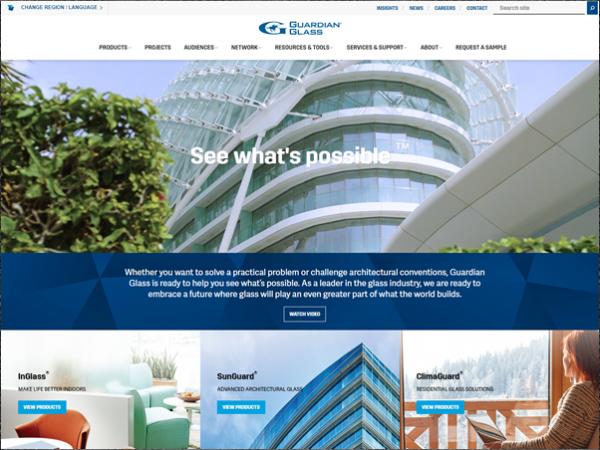
The redesigned global website helps visitors see what’s possible™ with exciting new imagery and content featured in updated paths. The tools are familiar, yet fresh.
“The new site delivers a concise brand message with upgraded navigation and exciting new content that is customized for the customers, partners, employees and other audiences for all of our regions,” explains Maxim Koldyshev, Guardian Glass global commercial excellence manager. “We're ready to share a new GuardianGlass.com that is engaging, informative, helpful and, we hope, inspiring in how we explore the wonders of glass.”
Important new components include:
- Visitor journeys that are more personal and deliver the right information faster for the architect, fabricator or glazier
- Regularly refreshed news, education and resource updates from the new Insights page
- An expanded, inspiring project gallery with more comprehensive information on how to build with light
- Enhanced video and animation to improve navigation and content delivery
- Automated product data generation that eliminates human error in updates across platforms and the new Projects search section
“The revitalized guardianglass.com is the result of the dedicated work of many team members, including thoughtful research and customer surveys,” says Koldyshev. “This work brought about a new internal communications platform that is resulting in a better customer experience, because of sharpened efficiencies and new collaboration and processes across the Guardian Glass regions. We look forward to continuing this journey.”

 600450


Add new comment